|
|
If possible, use all capitals; avoid using lower case lettering. When lower case letters are used, they are most often used along with capitals (such as in a proper name, where the initial letter is capitalized and the rest are lower case). In order to make the lower case letters a size that will translate well into a watermark, the capitals will need to be proportionately larger. |
|
|
If possible, avoid using fonts containing serifs. Although fonts with serifs may look interesting when in print, the thin dimensions of the serifs will be too small to be seen in the watermark, and may actually cause the watermark to look ragged and sloppy. |
|
|
Free-form or 'script' style fonts are possible if the narrowest part of any line is no thinner than 2.0mm. It is possible to make individual portions of any font a bit thicker in the process of making the plates. So it may be possible to alter just about any font you choose, despite a few thin portions. |
|
|
Lettering may be solid or outlined ~ or a combination of both. |
|
|
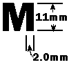
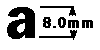
For letters, the narrowest lines should be no thinner than 2.0mm. The height of the letters should be no smaller than 8.0mm. Depending on the browser you are using, and the resolution your computer is set to, the actual size of font shown here may vary. |
|
|
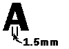
Enclosed spaces in letters, such as in the 'A', should be no smaller than 1.5mm. |